The Fueled Collective is a 18,000 square foot co-working office space in New York City’s posh SoHo neighborhood. Fueled is an award winning app design and development company that partnered up with artist Evan Desmond Yee and he turned one of meeting rooms into a mock Apple Store, as well as many other pieces scattered around the open work space. The exhibit is a commentary on startups and tech culture and, ironically, is inside a tech collective.
iStore as imaginary store.
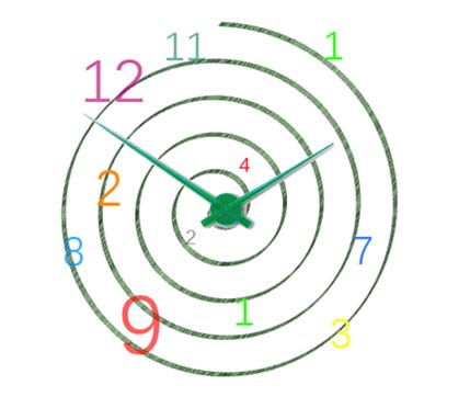
FALLEN CLOUD
Waiting is an unavoidable part of life. Computers are no exception in contributing to delay. They freeze our monitors and clog it with junk. One popular example is the Mac. In a stroke of brilliance, Yee took this simple color concept and from it forged two real life adaptations of Mac’s dreaded icon, which he coined the “Spinning Pinwheel of Death” to mock the Mac’s superiority. One hangs right above the receptionist’s head while the other is mounted on a table in the middle of the Fueled Collective’s waiting area. Yee explains that the mechanism behind his works of art are actually quite simple: there is one encompassing source of lighting behind the cover that gives the gives the flush of colors its life. Spinning blades continuously rotate in front of it like propellers in an engine, giving users the final impression that the icon is alive and running.
iPHOSSIL
This showcase features a pillar in the shape of very narrow, elongated rectangular prism that stands like a starved edifice. It may appear very skinny, but its content is anything but starved or frail. The structure is segmented into numerous layers of dirt and other bare elements of nature, like an archeological dig site.
In the middle of it all is an iPhone cased in plastic resin. Yee explained that all the layers of the art beneath the iPhone could be perceived as that which came before mobile and the layers above the iPhone as the future of cellular technology. When I asked Yee what the scope of history/magnitude of timeline the artwork encompassed, he replied that it’s up to the viewer’s imagination, that it can just as easily represent the millions of years before and after the iPhone as it can convey the days, weeks, or months surrounding its release. The iPhone is preserved in resin to symbolize the acuteness and delicacy of the present that we are immersed in.
REPLICA
A QR code by itself isn’t all that aesthetically pleasing, it’s the functionality that counts. But what if a QR
code’s function was to show you something beautiful? This QR painting does just that. Simply prepare your mobile device for a QR scan, lock its camera onto the portrait, and poof! If you’ve followed procedures correctly, your mobile will automatically take you to the Google image search results for a work of art. Yee explained that instead of showcasing an actual drawing within frame borders, a Google image search would be much more liberating.
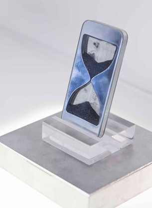
iFLIP
There was one point in time when the hourglass was the standard way of telling time. You can hold this item in the palm of your hands as if it were an actual iPhone. Yee goes on to say the iFlip is actually an accurate reflection of how mobile dependent human civilization has become. We accumulate hours upon hours on the phone, so much that we might be wasting our own lives away. However, instead of forging a representation of decay, Yee takes a subtler stance by crafting an hourglass inside of an iPhone as an active reminder for those holding it that precious time that is slipping away from them by the second. He also showed me that if you take a closer look, you’ll notice that the material inside the hourglass are chips of metal. That’s right. The “sand” that rests within the artwork is the resulting debris of a ground up iPhone itself. Ouch! That must’ve hurt the blender.
THE APP APP
Modern day mobile users are constantly barraged by the numerous apps on their phones and tablets and almost oppressed by the sheer multitude of apps available in general. Now it’s time to give your mind a rest from all the electronic bombardment. The “App App” is simply an “app template” or “blank app slate” in the color and form of a pinkish-red square block with rounded corners. Yee explained that this piece of art imitates the outline of an app as you would see on your phone, but is empty aside from its singular color scheme. He wants viewers to realize just how deeply we’re all immersed in app usage; meanwhile giving off the sensation of mobile liberty by not installing any particular app within its borders. Don’t just stare at it though. Come over and give it a nice pat. We don’t want you lifting it though. You might hurt yourself.

Photo credits SoAM Studio.
Video


